On This Page
Going Further
Now that we've had a chance to introduce some of the basics of Greenwood and having walked through putting together a basic site, let's take a moment showcase some of the additional capabilities and use cases you can leverage in Greenwood.
Prerendering
A fair observation from the walkthrough might be that the header and footer are really just producing static content. While the footer calculates a year, that really only needs to be done once at build time. Since Greenwood can easily server render Web Components leaning on DOM based hydration techniques (opens in a new window), we can make a couple useful optimizations here.
First, we can enable the prerender flag in a greenwood.config.js file which will do a one-time server render for any custom element tags in our HTML:
export default {
  prerender: true,
};
Now if we look in the HTML output for any of our pages, we will see pre-rendered HTML for the footer inside a <template> tag (this is Declarative Shadow DOM in action!):
<app-footer>
  <template shadowrootmode="open">
    <style>
      /* ... */
    </style>
    <footer class="footer">
      <h4>
        <a href="https://www.greenwoodjs.io/">My Blog ©2024 ◈ Built with GreenwoodJS</a>
      </h4>
    </footer>
  </template>
</app-footer>
We can go one step further and instruct Greenwood to strip out the <script> tags for these components by adding the data-gwd-opt='static' attribute to them, since we have no need for any interactivity on these components.
<script type="module" src="../components/footer/footer.js" data-gwd-opt="static"></script>
<script type="module" src="../components/header/header.js" data-gwd-opt="static"></script>
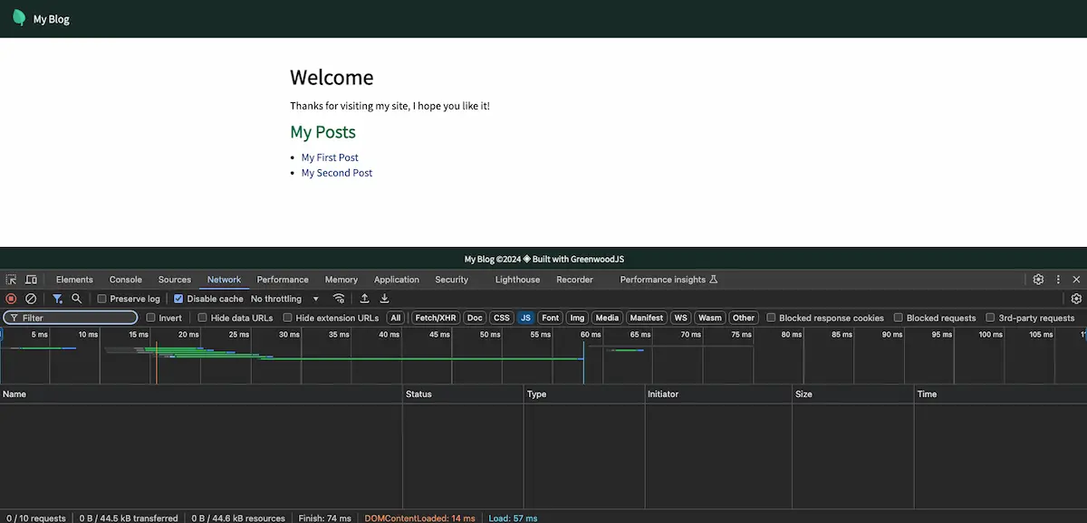
And now, no JS bundles in the network tab either! With that, we just got the best of both worlds; JavaScript for developers, HTML for users. 💚

Our Getting Started companion repo (opens in a new window) incorporates these changes.
Light DOM
While most of the examples so far have been using Shadow DOM, Greenwood is equally capable and encouraging of using Light DOM to render your (static / pre-rendered) Web Components. This is a great pattern to pair with when using something like Tailwind or our CSS Modules plugin.
Instead of rendering into a Shadow Root, you can just render into innerHTML:
export default class Header extends HTMLElement {
  connectedCallback() {
    this.innerHTML = `
      <header class="pt-10">
        <a
          class="flex justify-center p-2"
          href="/"
          title="My Home page"
        >
          <img
            class="w-full h-full max-w-xs header-logo"
            src="/assets/my-logo.png"
            alt="My Logo"
            height="200"
            width="200"
          />
        </a>
      </header>
    `;
  }
}

customElements.define("x-header", Header);
There is also the pattern of HTML Web Components (opens in a new window), which can be another great option for combining global styles with "slotted" Light DOM content.
export default class PictureFrame extends HTMLElement {
  connectedCallback() {
    const title = this.getAttribute("title");

    this.innerHTML = `
      <div class="picture-frame">
        <h6 class="heading">${title}</h6>
        ${this.innerHTML}
      </div>
    `;
  }
}

customElements.define("app-picture-frame", PictureFrame);
<html>
  <head>
    <script type="module" src="../components/picture-frame.js"></script>
    <style>
      .picture-frame {
        width: fit-content;

        & h6 {
          text-decoration: underline;
        }
      }
    </style>
  </head>
  <body>
    <app-picture-frame title="My Logo">
      <img src="/assets/my-logo.webp" width="200" height="200" />
    </app-picture-frame>
  </body>
</html>
As a general rule of thumb, if you need interactivity / hydration use Shadow DOM, if it's just for templating out static content, use a combination Light DOM + pre-rendering + static optimizations.
Either way it's your DOM, use it how you need it.
Content as Data
Greenwood also provides some general purpose helpers for more static driven sites (e.g. SSG) through our content as data features, including a programmatic Fetch based API. When combined with active frontmatter, this enables HTML-first templating which can then be used to initialize attributes for custom element tags on a per page basis. Very useful for creating navigation menus and other sorts of collections of content, even with active link highlighting, and no runtime JS needed! 💯
For example, we can define some frontmatter in a markdown file:
<!-- src/pages/blog/first-post.md -->
---
layout: blog
author: Project Evergreen
published: 2025-01-01
---

# My First Post

Lorum Ipsum
And access these values through HTML, like in a layout file:
<!-- src/layouts/blog.html -->
<html>
  <head>
    <title>My Site - ${globalThis.page.title}</title>
    <script type="module" src="../components/blog-post.js"></script>
  </head>
  <body>
    <app-blog-post
      title="Going Further"
      author="${globalThis.page.data.author}"
      published="${globalThis.page.data.published}"
    >
      <content-outlet></content-outlet>
    </app-blog-post>
  </body>
</html>
And the component might look like this:
export default class BlogPost extends HTMLElement {
  connectedCallback() {
    const title = this.getAttribute("title");
    const author = this.getAttribute("author");
    const published = this.getAttribute("published");

    this.innerHTML = `
      <div class="blog-post">
        <h2 class="heading">${title}</h6>
        <h3 class="byline">
          <span>By: ${author}</span>
          <span>Published: ${published}</span>
        </h3>

        </hr/>

        ${this.innerHTML}
      </div>
    `;
  }
}

customElements.define("app-blog-post", BlogPost);
Next Section
Let's wrap up our guide and get you onto building something great with Greenwood!