Walkthrough
Now that we have covered some of the basics and have our project ready to go, let's start building!
In this section, we'll walk through developing a site with Greenwood and making some content. We'll provide all the code so you can just follow along if you want. By the end, you'll have a simple website that you can build and deploy to any web server or hosting provider you like. What you do from there, is all up to you!
Feel free to follow along with our companion repo (opens in a new window) as you work through this section.
Local Development
First let's get the development server running. We can open this in our browser and get instant live reloading as we making changes, so we can see our work come alive in real-time.
npm run dev
yarn dev
pnpm dev
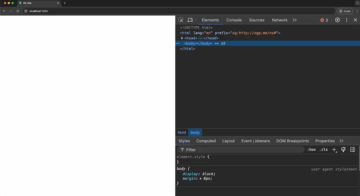
Congrats, you should have your first Greenwood site running at http://localhost:1984, though it will be quite empty at first.

Let's change that!
Creating Content
The heart of any website is its content. So let's build out some pages and layouts and get some content on the screen.
Pages
Let's scaffold out a couple pages to get things going. For this guide, we'll want the following:
- A home page
- Two blog post pages
Our home page will be simple landing page with links to our blog post pages:
<html>
  <body>
    <h1>Welcome</h1>

    <p>Thanks for visiting my site, I hope you like it!</p>

    <h2>My Posts</h2>
    <ul>
      <li><a href="/blog/first-post/">My First Post</a></li>
      <li><a href="/blog/second-post/">My Second Post</a></li>
    </ul>
  </body>
</html>
For the blog post pages, we're going to use Greenwood's markdown plugin for authoring these pages.
First, let's install the plugin:
npm i -D @greenwood/plugin-markdown
yarn add @greenwood/plugin-markdown --dev
pnpm add -D @greenwood/plugin-markdown
Then create a greenwood.config.js file and import the plugin:
import { greenwoodPluginMarkdown } from "@greenwood/plugin-markdown";

export default {
  plugins: [greenwoodPluginMarkdown()],
};
Now we can create a folder called blog/ in our pages directory and then create two markdown files called first-post.md and second-post.md:
# My First Blog Post

Lorem Ipsum...
# My Second Blog Post

Sed ut perspiciatis...
Layouts
Now that we have some pages, let's think about how we want organize the layout of our pages. For this guide, we will create the following layouts:
- app.html - This will be the layout we'll use to wrap all pages with our common styles and components (which we'll add in the next chapter)
- blog.html - This will be a layout specific to blog pages, which we'll configure using frontmatter
App Layout
To provide a wrapper to put all our common styles and components in, let's create a src/layouts/app.html file with this starting HTML. We'll include a basic <title> and <meta> and the <page-outlet> tag as a placeholder for where the page contents will go.
<html>
  <head>
    <title>My Blog</title>
    <meta name="description" content="My personal blog built with Greenwood." />
    <meta charset="utf-8" />
    <meta name="viewport" content="width=device-width, initial-scale=1" />
  </head>

  <body>
    <main>
      <page-outlet></page-outlet>
    </main>
  </body>
</html>
Blog Posts Layout
For the individual blog posts, we're going to want a custom layout for those pages. So what do we do? Just create a new layout!
Create a src/layouts/blog.html file, including our <content-outlet> placeholder tag for our markdown content, and some links to help with navigating our site:
<html>
  <body>
    <article>
      <content-outlet></content-outlet>
    </article>

    <hr />

    <h3>More Posts</h3>
    <nav>
      <ul>
        <li><a href="/blog/first-post/">My First Post</a></li>
        <li><a href="/blog/second-post/">My Second Post</a></li>
      </ul>
    </nav>
  </body>
</html>
In case you don't see the layout effects taking place for the blog pages, you may need to restart the dev server for frontmatter changes to take effect (opens in a new window).
Styling
OK, so we've made some content which you should see reflected in your browser, but what about the look and feel? Yes, of course, let's add some CSS!
Let's make a src/styles/theme.css for our global styles and variables, which we can then reference in any of our layouts, pages, or components.
@import url("//fonts.googleapis.com/css?family=Source+Sans+Pro&display=swap");

* {
  margin: 0;
  padding: 0;
  text-decoration: none;
  box-sizing: border-box;
}

body {
  font-family: "Source Sans Pro", sans-serif;
  line-height: 1.4;
}

:root {
  --color-accent: #016341;
  --color-link: #1d337a;
}

h2 {
  color: var(--color-accent);
  font-size: 2rem;
  margin: 5px 0;
}

a {
  color: var(--color-link);
}
Now we can add a <link> tag pointing to this CSS file into our app.html layout. Easy! 💥
<html>
  <head>
    <title>My Blog</title>
    <meta name="description" content="My personal blog built with Greenwood." />
    <meta charset="utf-8" />
    <meta name="viewport" content="width=device-width, initial-scale=1" />
    <link rel="stylesheet" href="../styles/theme.css" />
  </head>

  <body>
    <!-- ... -->
  </body>
</html>
Referencing the companion repo (opens in a new window), go ahead and create a CSS file each for the home page and blog styles and
<link>those up in their respective HTML files.
Components
To create the header and footer for our site, we'll be using Web Components (opens in a new window). Web Components are the web platform's native way (opens in a new window) to create custom HTML behaviors that (can) encapsulate their own styles, are light weight, and make for a great templating solution.
Combined with Declarative Shadow DOM (opens in a new window), Web Components can also benefit from SSR and can tap into hydration techniques that are all built in to the browser!
Let's use the footer component for this guide as an example:
const template = document.createElement("template");
export default class FooterComponent extends HTMLElement {
connectedCallback() {
const year = new Date().getFullYear();
if (!this.shadowRoot) {
template.innerHTML = `
<style>
.footer {
position: fixed;
bottom: 0;
width: 100%;
background-color: var(--color-bg);
min-height: 30px;
padding-top: 10px;
& a {
color: #efefef;
text-decoration: none;
}
& h4 {
width: 90%;
margin: 0 auto;
padding: 0;
text-align: center;
}
}
</style>
<footer class="footer">
<h4>
<a href="https://www.greenwoodjs.io/">My Blog ©${year} ◈ Built with GreenwoodJS</a>
</h4>
</footer>
`;
this.attachShadow({ mode: "open" });
this.shadowRoot.appendChild(template.content.cloneNode(true));
}
}
}
customElements.define("app-footer", FooterComponent);
What we've done is:
- Create a
FooterComponentclass that extendsHTMLElement - If no shadow root is detected, create a
<template>element - We add some styles and HTML into the template
- We instantiate a shadow root and append that to the template
- We then define a tag for our new
<app-footer>and pass a reference to our class
From there, we can reference this in our App layout with a <script> tag and then add the <app-footer> tag to the bottom of the layout:
<html>
  <head>
    <title>My Blog</title>
    <meta name="description" content="My personal blog built with Greenwood." />
    <meta charset="utf-8" />
    <meta name="viewport" content="width=device-width, initial-scale=1" />
    <link rel="stylesheet" href="../styles/theme.css" />
    <script type="module" src="../components/footer.js"></script>
  </head>

  <body>
    <main>
      <page-outlet></page-outlet>
    </main>

    <app-footer></app-footer>
  </body>
</html>
Now you can do the same for an
<app-header>. See the companion repo (opens in a new window) for a complete working example. Voila! All our pages now have a header and footer! 🎉
Final Build
Now that we have all our content everything we developed working, we should generate a production build and verify that output locally. For that, we just need to run Greenwood's build command, followed by its serve command:
npm run build && npm run serve
yarn build && yarn serve
pnpm build && pnpm serve
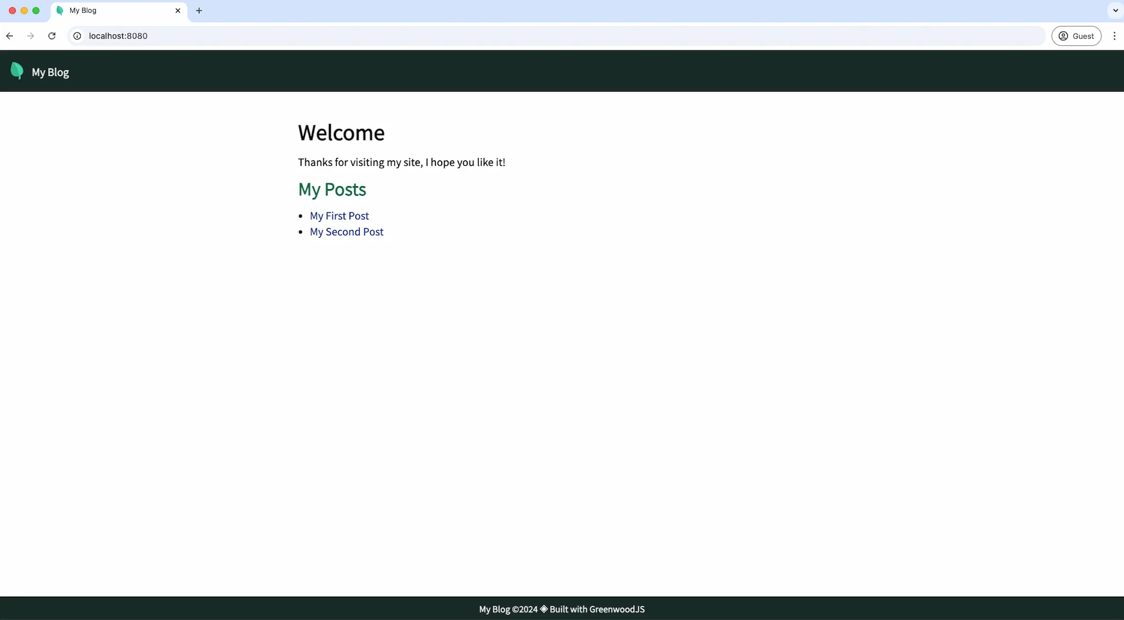
If all goes well, you should be able to open http://localhost:8080 in your browser and see a result similar to this:

Next Section
Phew!
Good work, now you have a Greenwood project ready to publish and deploy. Before we wrap up, let's explore a few ways you can take Greenwood further by demonstrating some additional use cases.